Mer makes assemblage out of found and cast-off material. The brand is named for the moment raw material finds its first form — a museum monograph printed on dark stock, not a portfolio. Single page. One piece. One quote. Inquire.
Mer was pivoting full-time into assemblage sculpture with her inaugural piece finished — Wings for the Fallen, a mixed-media memorial — and needed an introduction that read like the work, not like a portfolio. The wrong move would have been five hero shots and a contact button. Nothing about that matches what Mer makes.
The brief became: build the room the piece deserves. Single page. Dark. Slow. Reverent. Museum monograph register, not gallery storefront. Mer can add work over time — but the introduction is one piece, looking like one piece.
The direction pivoted mid-project. The piece pushed back against the original light-linen comp — Wings for the Fallen lives on a near-black ground, and the brand had to follow. The revised version is darker, slower, more reverent. The piece sets the tone; the brand doesn't try to sell the piece.
Near-black, paper warm-white, amber as the only color. Amber lives on the asterisk, the focused-field underline, the monogram — and nowhere else.
An italic editorial serif for display. A clean low-weight sans for body. No third face. The restraint is the system.
No entrance animations. Every element resolves quietly. The wordmark arrives dead-still. The only sustained motion is a slow zoom on the hero — slow enough to feel like breathing, not panning.
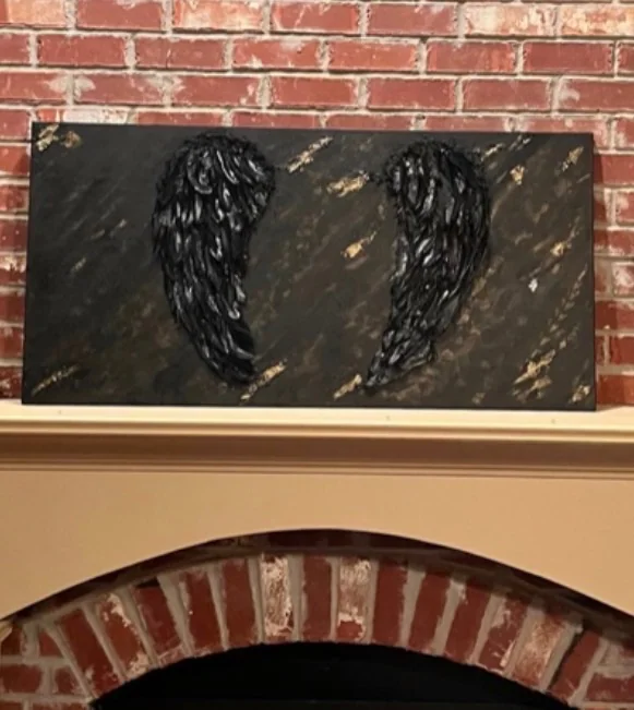
The first thing past the hero is the piece itself, treated like a museum wall: image above, label below. The label format is borrowed verbatim from institutional practice — title, year, medium, dimensions, provenance — and adds a single field most museums don't have: what this is about, in the artist's own voice. The conversion isn't "buy now." The conversion is being able to look at the work for an extra fifteen seconds before reading anything.

Hero with Ken-Burns zoom → museum-label feature → asterisk pause → closing italic quote → inquire form. Routes only forward.
Wordmark, monogram (N + asterisk), palette tokens, type pairing. Three working files; no brand-guide PDF because the page IS the guide.
A subtle texture across the whole page gives every surface the tooth of a painted ground. Five percent opacity, fixed to the viewport, present without being seen.
A direct line from the form to Mer's inbox. No third-party form service, no tracking, no newsletter funnel. The only ask is whether the visitor is asking.
| Layer | State |
|---|---|
| Site on nascence.art | live |
| Brand identity | shipped |
| Inquire form straight to Mer's inbox | running |
| First gallery conversations | in motion |
I didn't know what the piece looked like to other people until I saw it on that page. The framing was right. The page is the only place Wings for the Fallen feels finished outside the studio.
Mer Altom · Artist, Nascence